Why UX/UI Design Can Make or Break Your Website
Visitors decide in seconds whether a website deserves their attention. Here is how user experience and interface design shape that decision — and what to fix first.
A website is often the first conversation a business has with a potential customer. Long before anyone reads your About page, they have already formed an impression from how the site looks, how quickly it responds and how easy it is to find what they came for. That impression is the product of two disciplines working together: user experience (UX) and user interface (UI) design.
UX is about how the site works — the structure, the journeys, the logic behind each step. UI is about how it looks and feels — typography, colour, spacing, components and motion. When either is neglected, visitors feel it immediately, even if they could not explain why.
First impressions are made in seconds
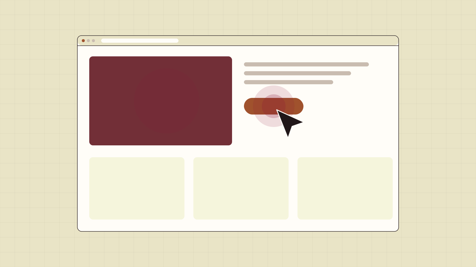
People scan rather than read. In the first moments on a page they are asking three questions: Am I in the right place? Can I trust this? What should I do next? A clear headline, a calm layout and an obvious primary action answer all three. A cluttered hero, competing buttons and vague copy answer none of them.
Good UI design builds trust through consistency. When buttons, headings and spacing behave predictably, the site feels professional. When every section looks slightly different, it feels assembled rather than designed — and visitors subconsciously extend that judgement to the business itself.
Usability problems quietly cost you customers
Most usability problems do not cause complaints. Visitors simply leave. Common culprits include:
- Navigation that uses internal jargon instead of the words customers use
- Forms that ask for too much information too early
- Low-contrast text that is hard to read on a phone outdoors
- Calls to action that are hidden below long introductions
- Interactive elements that do not work with a keyboard or screen reader
Each of these adds a little friction. Together they turn a motivated visitor into a lost one. The fix is rarely a redesign from scratch; it is careful attention to the moments where people hesitate.
Mobile is the default, not an afterthought
For many businesses the majority of visits now come from phones. Designing mobile-first means deciding what matters most when space is limited, sizing touch targets for thumbs and making sure pages load quickly on ordinary mobile connections. A layout that merely shrinks the desktop version usually fails on all three counts.
Performance is part of the experience
Speed is a design decision. Heavy hero videos, unoptimised images and stacks of third-party scripts all make pages slower, and slow pages feel broken. Search engines also measure real-world loading and interaction performance through Core Web Vitals, so a sluggish site can affect visibility as well as conversions.
The best interface is the one visitors never have to think about — it simply gets out of the way.
Accessibility widens your audience
Accessible design ensures people with visual, motor or cognitive impairments can use your site. It also makes the site better for everyone: clear focus states help keyboard users, readable contrast helps anyone in bright light, and descriptive links help people skimming on a small screen. In many regions accessibility is also a legal expectation for businesses.
Where to start
If you are unsure whether your website is helping or hurting, start with a short audit:
- Watch three people unfamiliar with your business try to complete your most important task
- Test your key pages on a mid-range phone using a mobile connection
- Check text contrast and try navigating the site using only the keyboard
- Count the actions competing for attention on your homepage hero
The findings will usually point to a handful of high-impact changes. UX and UI design are not decoration; they are the difference between a website that looks finished and one that actually works for the people using it.