
Innovation in Every Swipe
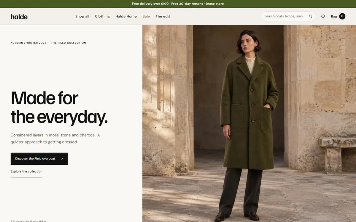
A mobile-first storefront for a fashion label
- Type
- Self-initiated concept
- Discipline
- E-commerce experience
- Live build
- Fashion Store demo
01Introduction
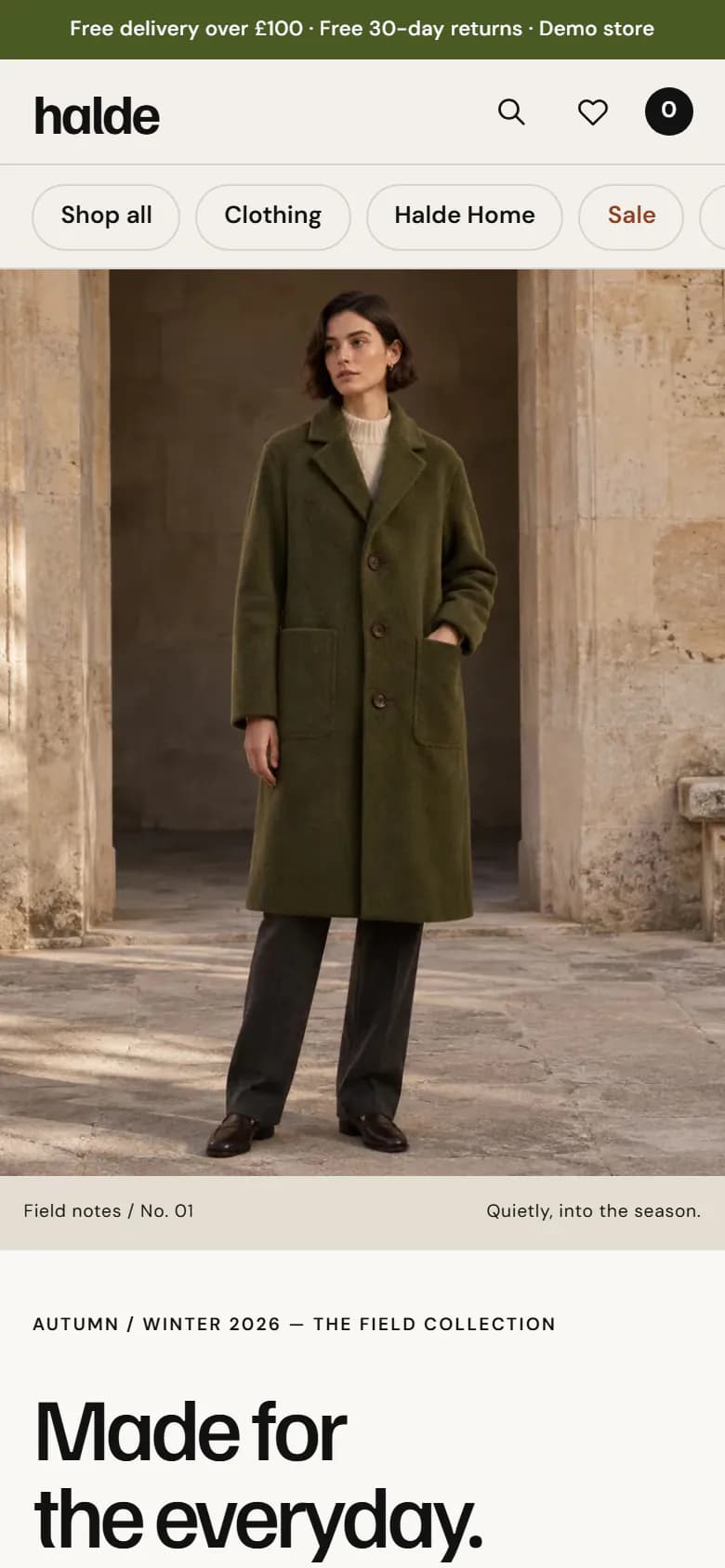
More than half of fashion browsing happens on a phone, often one-handed. This study rethinks a storefront around thumbs first — swipeable collections, quick product previews and a checkout path with as few taps as possible.
02Challenge
Desktop-first stores shrink grids and menus onto small screens. Product imagery gets cropped, filters hide behind multiple taps, and heavy pages stall on mobile networks.
03Objectives
- Collections that can be browsed with a single thumb
- Product imagery delivered at the right size for every screen
- Clear category and product navigation without deep menus
04Approach
Gesture-led browsing
Hero, category and trending rails are touch carousels with visible progress and keyboard support.
Image discipline
Every product image ships responsive sizes in modern formats, keeping the page light.
Tabbed discovery
Product tabs switch collections in place instead of loading new pages.
05Design & development
Carousels load their script only on pages that contain one, so content pages stay lightweight. Each slider has an explicit configuration per breakpoint rather than a one-size-fits-all default.
Images are served through the Next.js image optimiser with intrinsic dimensions, eliminating layout shift as products load.
Related live buildFashion Store demoEditorial fashion storefront with a campaign hero, a photographed catalogue, colour and size choices and a demo bag.Open the demo06Technologies
07Final solution
The concept produces a storefront that feels native on a phone and still scales elegantly to desktop. The Fashion Store demo is the working build of this layout.
Explore the live demoThis is a self-initiated concept study by Straux Technologies. It does not describe work for a client, and no commercial results are claimed.